Yesterday, the Buffalo Sabres introduced their new third jerseys for the upcoming season and boy—are they really freakin’ bad. One could make the argument that the Sabres didn’t really help themselves by choosing Steve Ott to model them for the public, but that might be a whole different article for another day.
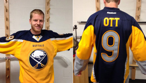
(You know these jerseys are butt ugly when Steve Ott is no longer the ugliest thing in the picture.)
Anyway, just by glancing at the new third jerseys, it’s pretty easy to say that universally everyone seemed displeased with them. And thus, here at Skate in the Crease, we felt it was time to go back into time and check out another famously reviled jersey.
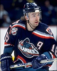
(Even Ziggy Palffy's mullet and half face visor can't save this picture)
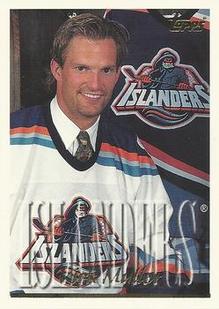
Ah, yes—the wonderful New York Islanders “Fisherman/Fishsticks” jersey. Who can forget these bad boys? It was enough to cause a PR meltdown on the size of Chernobyl in Long Island. After just a season, the team tried to rid themselves from this absolutely terrifying eyesore. Coupled with the terrible new jerseys was a mediocre team that was a far cry from those underdogs in 1993. The Islanders quickly became the laughingstock of the NHL, and went into panic mode. In typical Islanders fashion, when the organization went ahead with plans to amend their jersey for the following season, the NHL actually put them in the doghouse by stating that the Islanders didn’t give them the proper time to approve those changes, and thus, the team was stuck with the “Fisherman” jerseys for another season.
So here we are, almost twenty years later—and maybe, just maybe we can give these jerseys another glance. After all, let’s not forget that there have been some hideous jerseys that have come after the “Fisherman” jerseys. Is it time for us to give these a break? Maybe there is an underlying reason why the “Fisherman” jerseys will always be mocked and despised, especially by Islanders fan.
The major question is this: Do people hate the “Fisherman” jersey because it is that ugly, or is there something more? For long-time Islanders fan who loathe these jerseys, do they hate them because the jerseys actually represent much more than a terrible logo design? Is it because the jersey themselves put the spotlight on chronic ownership problems and reckless management, headed by none other than Mike Milbury?
After missing the playoffs in the lockout year of the ’94-’95 season (the first of six consecutive seasons), general manager Don Maloney decided to shake up the roster. Gone was fan favorite and hero of the ’93 playoffs, Peirre Turgeon, out was leading scorer Ray Ferraro, who Maloney would choose not to re-sign. In exchange for Turgeon and Malakhov was Kirk Muller, who won the Stanley Cup in 1993 with the Montreal Canadiens. The trade to the Islanders upset Muller, who would only go on to play 45 games for New York before being sent to the Leafs. Joining Muller was Mike Milbury behind the bench.
(These jerseys are so bad you didn't even realize how ugly Muller's tie is, did you?)
But hey Islanders fans, cheer up—because during the summer of 1995, ownership decided to revamp the logo and jersey design for the team. In Fishsticks: The Rise and Fall of the New York Islanders, authors Peter Botte and Alan Hahn offer the reasoning for the logo change—for those youngsters (not so young anymore), who tapped into NHL 96 and NHL 97 for Sega Genesis, a simple flick of the ‘on’ button to your gaming system might take you back to the wonderful times where the new logos of the San Jose Sharks, Mighty Ducks of Anaheim, Florida Panthers, and Tampa Bay Lightning smoothly (or not so smoothly) transitioned with the likes of the Leafs, Red Winged-wheel, and the Montreal Canadiens logo.
The NHL, ballooned on the idea of expansion and lust for more money, thought the Islanders needed a new re-fined look. They actually recommended SME Design, who modernized the jerseys of the St. Louis Blues and created the Florida Panthers logo. In 1994 the design was agreed upon, in two years it would go into effect. Almost immediately there was animosity that faced the design—according to Fishsticks, one week after the introduction in June of 1995, almost 80 percent of 1,000 respondents thought the design was lacking, and with a big giant failure on the ice, who could blame them? Hell, even Rangers fans, a years fresh from their 1994 Stanley Cup victory, chanted, “We want fishsticks! We want fishsticks!”
The NHL, ballooned on the idea of expansion and lust for more money, thought the Islanders needed a new re-fined look. They actually recommended SME Design, who modernized the jerseys of the St. Louis Blues and created the Florida Panthers logo. In 1994 the design was agreed upon, in two years it would go into effect. Almost immediately there was animosity that faced the design—according to Fishsticks, one week after the introduction in June of 1995, almost 80 percent of 1,000 respondents thought the design was lacking, and with a big giant failure on the ice, who could blame them? Hell, even Rangers fans, a years fresh from their 1994 Stanley Cup victory, chanted, “We want fishsticks! We want fishsticks!”
(All of these people don't realize that Glen Sather hasn't ruined their team yet through free agency. HA!)
Some of the hardcore Islanders fan (I can’t believe I just wrote those words) pulled out all the stops to end the abomination of their precious team. First amendment rights were used for assemblies and petitions, and during the six years of losing, the Islanders organization saw their 13,000 season ticket holders drop down to around 5,000. Faced with such unbridled protest against the new jersey and logo, the Islanders quickly did about face and announced that they were bringing the old logos back.
However, that didn’t stop this man….
However, that didn’t stop this man….
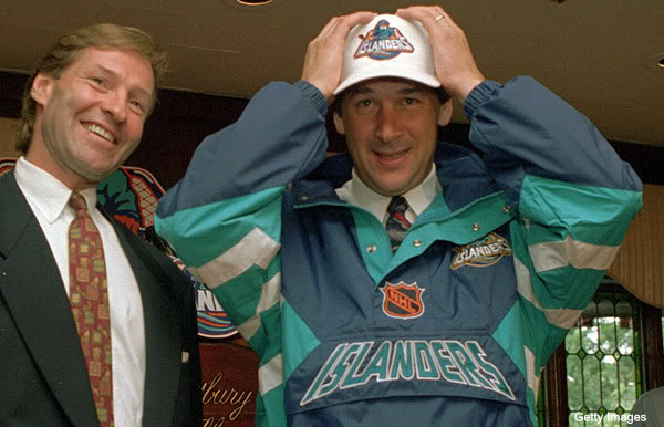
(Milbury: "How my hat look? Good?")
From oh, trading away Zdeno Chara, an actual useful Wade Redden, Eric Brewer, Roberto Luongo, Todd Bertuzzi, selecting Rick DiPietro 1st overall, and to top it off, the 2nd overall pick in the 2001 draft which would later turn into Jason Spezza.
So yeah, I can see why Islanders fan want burn this logo in effigy.
So yeah, I can see why Islanders fan want burn this logo in effigy.
(Rest in peace, my good friend.)
 RSS Feed
